Use white space to create a visual hierarchy on the page.
GOV.UK elements Layout
Contents:
Page width
The default maximum page width is 1020px, but go wider if the content requires it.
Use a grid to lay out your content. To prevent long lines of text, content should sit in a column which is two-thirds of the page width.
Long lines reduce legibility, so all lines of text should be no longer than 70 to 80 characters.
Screen size
Design for small screens first using a single column layout.
Optimise for different screen sizes, but don’t make assumptions about what devices people are using.
Spacing
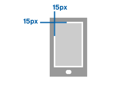
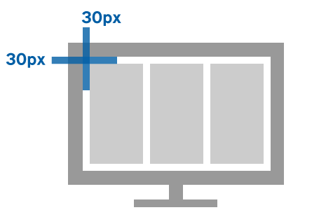
- spacing between elements is usually 5px, 10px, 15px or multiples of 15px
- gutters are 15px for smaller screens and 30px for larger screens


Grid unit proportions
- introduce columns as the content requires it – base column ratios on halves, thirds or quarters of the page width
- for screen breakpoints use media queries – find these in the GOV.UK frontend toolkit _conditionals.scss file
Full width
Content
    <div class="grid-row">

  <div class="column-full">
    <p>Content</p>
  </div>

</div>
Halves
Content
Content
    <div class="grid-row">

  <div class="column-one-half">
    <p>Content</p>
  </div>

  <div class="column-one-half">
    <p>Content</p>
  </div>

</div>
Thirds
Content
Content
Content
    <div class="grid-row">

  <div class="column-one-third">
    <p>Content</p>
  </div>

  <div class="column-one-third">
    <p>Content</p>
  </div>

  <div class="column-one-third">
    <p>Content</p>
  </div>

</div>
Two thirds / One third
Content
Content
    <div class="grid-row">

  <div class="column-two-thirds">
    <p>Content</p>
  </div>

  <div class="column-one-third">
    <p>Content</p>
  </div>

</div>
One third / Two thirds
Content
Content
    <div class="grid-row">

  <div class="column-one-third">
    <p>Content</p>
  </div>

  <div class="column-two-thirds">
    <p>Content</p>
  </div>

</div>
Quarters
Content
Content
Content
Content
    <div class="grid-row">

  <div class="column-one-quarter">
    <p>Content</p>
  </div>

  <div class="column-one-quarter">
    <p>Content</p>
  </div>

  <div class="column-one-quarter">
    <p>Content</p>
  </div>

  <div class="column-one-quarter">
    <p>Content</p>
  </div>

</div>